Certified Business
With over 10,000 orders
With over 10,000 orders

Photo by Ali Elliott on Unsplash
Learning to read a topographic map is like learning to see the world in a whole new way. You're essentially translating a flat piece of paper, full of squiggles and symbols, into a three-dimensional landscape in your mind's eye. It’s a skill, and like any skill, it just takes a little practice.
At its core, it's about understanding contour lines to see the shape of the land, using the map scale to judge distance, and referencing the legend to identify real-world features like rivers, trails, and buildings. Get these down, and you're well on your way to navigating with confidence.
Unfolding a topo map for the first time can feel a little overwhelming. All those lines and symbols can look like a secret code. But here’s a pro tip: before you even try to find your location, look at the edges of the map. The margins are your instruction manual.
This is where you'll find the really important context, like the map's name (for example, "Mount Rainier West Quadrangle"), when it was published, and who made it, often the U.S. Geological Survey (USGS). This stuff tells you how old the information is and the specific area you're looking at.
What we're doing is building on centuries of cartography. Early map-makers, like those who created the Carte géométrique de la France way back in 1789, laid the groundwork for the incredibly detailed maps we use today. You can actually read more about the history of topographic maps on Wikipedia if you're a history buff like me.
To really get the hang of this, you need to zero in on five key ideas. Think of them as the building blocks for everything else. Once you understand these, planning a route or figuring out exactly where you are becomes second nature.
By focusing on these five elements first, you build a mental framework that makes every other detail on the map easier to understand. It removes the intimidation factor and turns a confusing document into a powerful tool for adventure.
Contour lines are the real heart of any topographic map. I get it—at first glance, they look like a random mess of brown squiggles. But they’re actually telling a three-dimensional story about the landscape, just flattened onto a two-dimensional piece of paper. If you want to learn how to read a topo map, this is the skill to master.
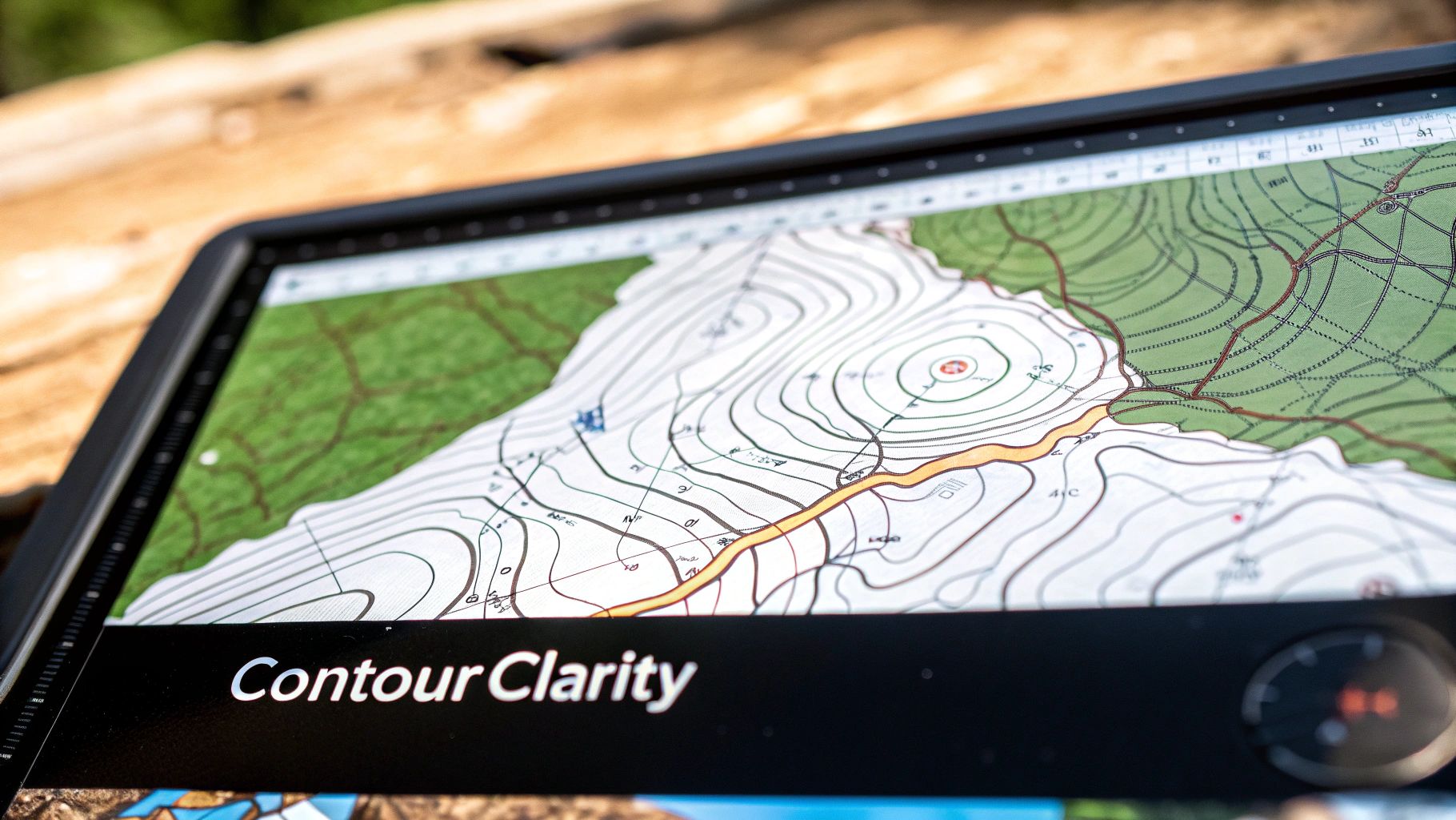
Think of it this way: each line connects points that are at the exact same elevation above sea level. If you could somehow walk perfectly along one of these lines in the real world, you wouldn't be going uphill or downhill at all. You'd stay completely level. That simple concept is the key to seeing the terrain in your mind's eye before you ever hit the trail.
Every map has a contour interval. This is just the vertical distance—the elevation change—between any two lines sitting next to each other. You can always find this number printed in the map's margin, usually right next to the scale. A pretty common interval on USGS maps is 40 feet, but it definitely varies.
Knowing this number is non-negotiable. If that interval is 40 feet, then crossing from one line to the next means you've just climbed or dropped exactly 40 feet. This little piece of info is what turns those abstract lines into hard data you can use to plan your day.
For example, say you count five gaps between contour lines on a section of trail you plan to hike. You can do some quick back-of-the-napkin math: 5 gaps x 40 feet/gap = 200 feet of climbing. This is exactly how you start to estimate how tough a hike is going to be.
The real magic happens when you start associating the spacing of these lines with the steepness of the terrain. This is the single most practical skill for real-world navigation.
Once you get a feel for the spacing, you can start picking out major landforms just by looking at the patterns the lines make. This is where you graduate from simply reading the map to actually understanding the landscape around you.
To save you from going cross-eyed, maps include index contours. These are darker, thicker lines that pop up every fifth contour line. More importantly, they’re labeled with their exact elevation.
So, instead of having to count dozens of tiny lines all the way from sea level, you can just find the nearest index contour and count up or down from there. It makes figuring out the elevation of a specific point—like that perfect campsite or a trail junction—so much faster and less prone to error.
This practice has been a staple of cartography for over a century. The USGS started systematically mapping the United States way back in 1884, painstakingly drawing these lines to connect points of equal elevation. You can discover insights on how topo maps are created at ESRI.com to get a deeper look at the history behind these invaluable tools.
Okay, let's look beyond those squiggly contour lines. Your map is packed with a ton of other information, all communicated through a language of symbols and colors. This is where you really start to build a mental picture of what you'll find on the ground.
The key to it all is the map's legend. Think of it as the official dictionary for everything you see.
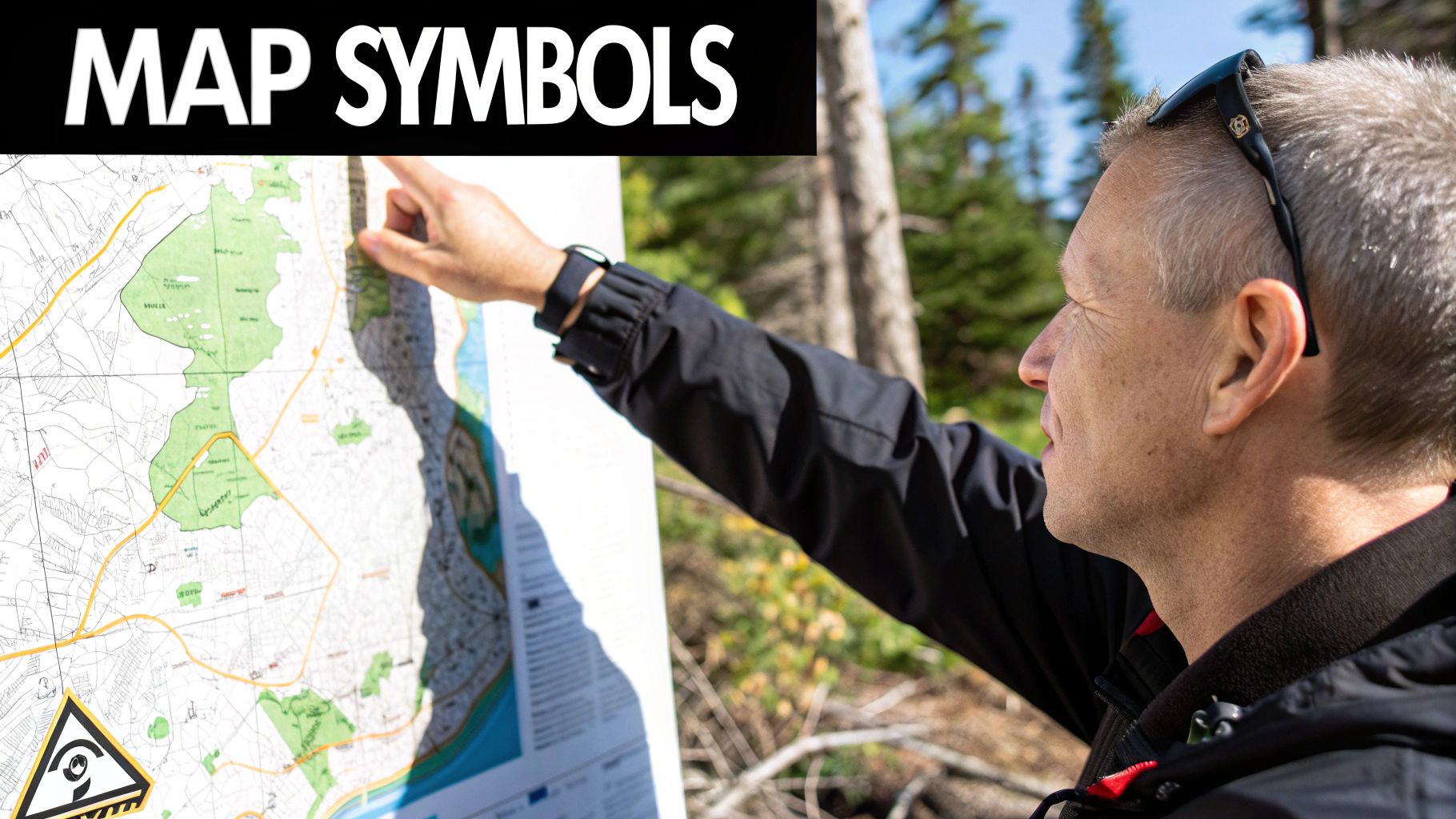
This little box explains what every icon, line, and color patch represents. These symbols aren't just for hikers; they're standardized so that geologists, park rangers, and search-and-rescue teams are all speaking the same visual language.
Thankfully, the color coding is pretty intuitive, and you'll find it's consistent on almost any topographic map you pick up. Here's a quick rundown of what to look for:
The colors on a map provide a quick, at-a-glance understanding of the terrain. Instead of just seeing lines, you start to see forests, rivers, and roads. Here's a simple table to help you decode the most common symbols you'll encounter, organized by their standard colors.
| Color | Represents | Common Symbols |
|---|---|---|
| Blue | Water features | Rivers (solid/dashed lines), lakes, ponds, swamps, marshes |
| Green | Vegetation | Dense forests (solid green), open meadows, scrubland (lighter green/white) |
| Black | Man-made features | Trails (dashed lines), roads, buildings (squares), railroads, boundaries |
| Brown | Topographic features | Contour lines showing elevation and terrain shape |
| Red | Major roads & land divisions | Highways, major roads, townships, and range lines |
Knowing this "color language" is a game-changer for planning. Spotting a blue line crossing your intended path means you've got a potential water source or a tricky crossing. Seeing a solid black trail line turn into a dashed one often means the trail becomes less maintained or harder to follow.
For a deeper dive into the little icons you might find in developed areas, especially campgrounds, we have a whole guide on decoding campground symbols in US parks.
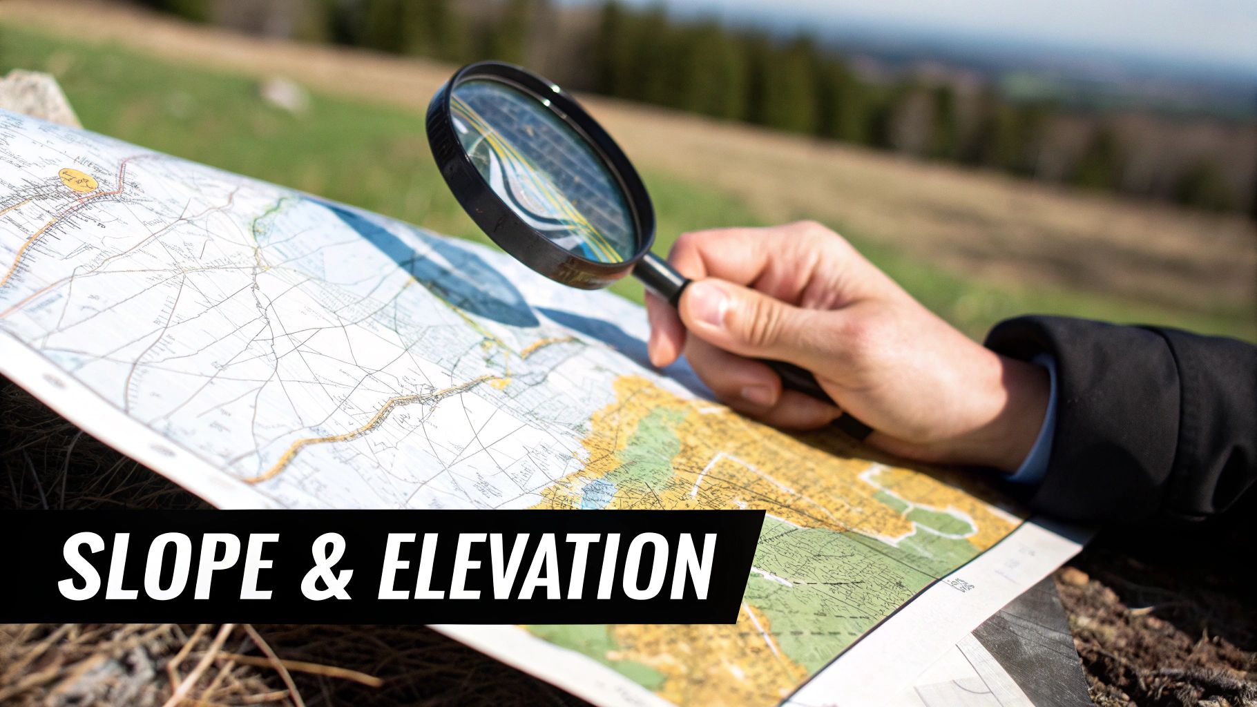
Alright, let's talk about how you turn a measurement on a piece of paper into an actual distance on the ground. This is where map scale comes in.
You'll usually find the scale printed in the margin of the map. A very common and useful scale for backcountry hiking is 1:24,000.
What does that even mean? It's a ratio. It means one unit on the map (like an inch) equals 24,000 of those same units on the ground. So, one inch on your map represents 24,000 inches in the real world, which works out to be about 2,000 feet. This scale is popular because it strikes a perfect balance, showing plenty of detail without requiring you to carry a ridiculously huge map.
The U.S. Geological Survey (USGS) has been the king of these maps for a long, long time. They've published over 175,000 different topographic maps, many of which use this exact 1:24,000 scale. It's a massive and fascinating project.
Now, while the ratio is the technical definition, the most practical tool on the map for measuring distance is the bar scale. This is that little printed ruler you see at the bottom, marked out in miles, feet, and kilometers.
Forget doing mental math with ratios. The easiest way by far is to take the edge of your compass, a piece of paper, or even a twig, and mark the distance of a trail section on it. Then, just line it up with the bar scale to get an instant reading of the real-world distance.
This is my go-to method out on the trail for a quick reality check. If I measure a two-mile stretch and see the contour lines are packed super tight, I know those two miles are going to be a real grind and I need to budget more time and energy. It's this combo of symbols, scale, and contours that really turns you into a confident navigator.
A map is pretty useless if you can't line it up with the world around you. This is where orientation comes in; it’s the simple but critical act of turning your map so it mirrors the landscape you're actually standing in. Get this wrong, and even the most detailed map will send you wandering in the wrong direction.
The easiest way to get oriented is to find North. Luckily, almost every topographic map is printed with North at the top edge. Grab your compass, lay it flat on the map, and then turn both of them together until the compass needle lines up with North on its dial. Just like that, your map is oriented. The hills, valleys, and streams on the paper should now correspond with what you see in the real world.
This one move is fundamental. It bridges the gap between the abstract symbols on the page and the tangible world at your feet, turning a simple piece of paper into a genuine navigation tool. It’s the very first thing you should do before plotting a course or even thinking about taking a bearing.
Now, let's get into a detail that trips up a lot of beginners: not all "Norths" point to the same place. This little wrinkle is called declination, and it's why just pointing your compass north isn't quite enough for dead-on accuracy.
Believe it or not, there are three different Norths to keep in mind:
Here's the kicker: Magnetic North and True North are not in the same location. The angle between them is called magnetic declination, and it changes depending on where you are on Earth.
Ignoring declination is one of the biggest rookie mistakes you can make in the backcountry. A few degrees might not sound like much, but over a multi-mile hike, it can throw you off course by hundreds of yards—plenty of distance to miss a trail junction or end up in sketchy terrain.
Thankfully, your map tells you exactly how to handle this. Tucked away in the margin, you'll find a small declination diagram. This little guy shows you the angular difference between Magnetic North (MN) and Grid North (GN) for that specific map area.
For instance, your map might say "11° East." This means that in your location, your compass needle will naturally point 11 degrees east of True North. To navigate with any real accuracy, you have to account for that difference.
Most modern hiking compasses make this easy with an adjustable declination scale. You can just "set it and forget it" by adjusting the scale to match the value on your map. From then on, the compass automatically corrects every bearing you take. If you're using a more basic compass, you'll have to do the math in your head, adding or subtracting the declination angle every time. We dive deep into this process in our guide on how to use a compass and map together.
By properly setting your declination, you’re ensuring that the direction you follow on your compass matches the real path on the ground. It’s a non-negotiable skill for anyone serious about navigating in the wild.
Alright, this is where it all comes together. Reading a map is one thing, but using it to craft a smart, safe, and genuinely fun route is where the real skill lies. Let's break down how an experienced navigator takes all those lines and symbols and turns them into a solid plan.
Imagine you've got your eye on a remote alpine lake. Your first move is to just stare at the map and see the big picture. Eyeball the terrain between where you are and where you want to be. You can immediately toss out certain routes just by looking at the contour lines. A tight stack of brown lines? That’s a cliff or a brutal, soul-crushing climb. No, thank you. You're looking for the path where the lines are spread out, suggesting a gentler slope that won't have you gasping for air every ten feet.
Once you've spotted a few possible corridors, it's time to zoom in. The goal isn't just the flattest route; it's the smartest one. This is where two of my favorite navigation tricks come in: handrails and backstops.
This infographic lays out the very first steps you need to take before you even think about drawing a line on the map.
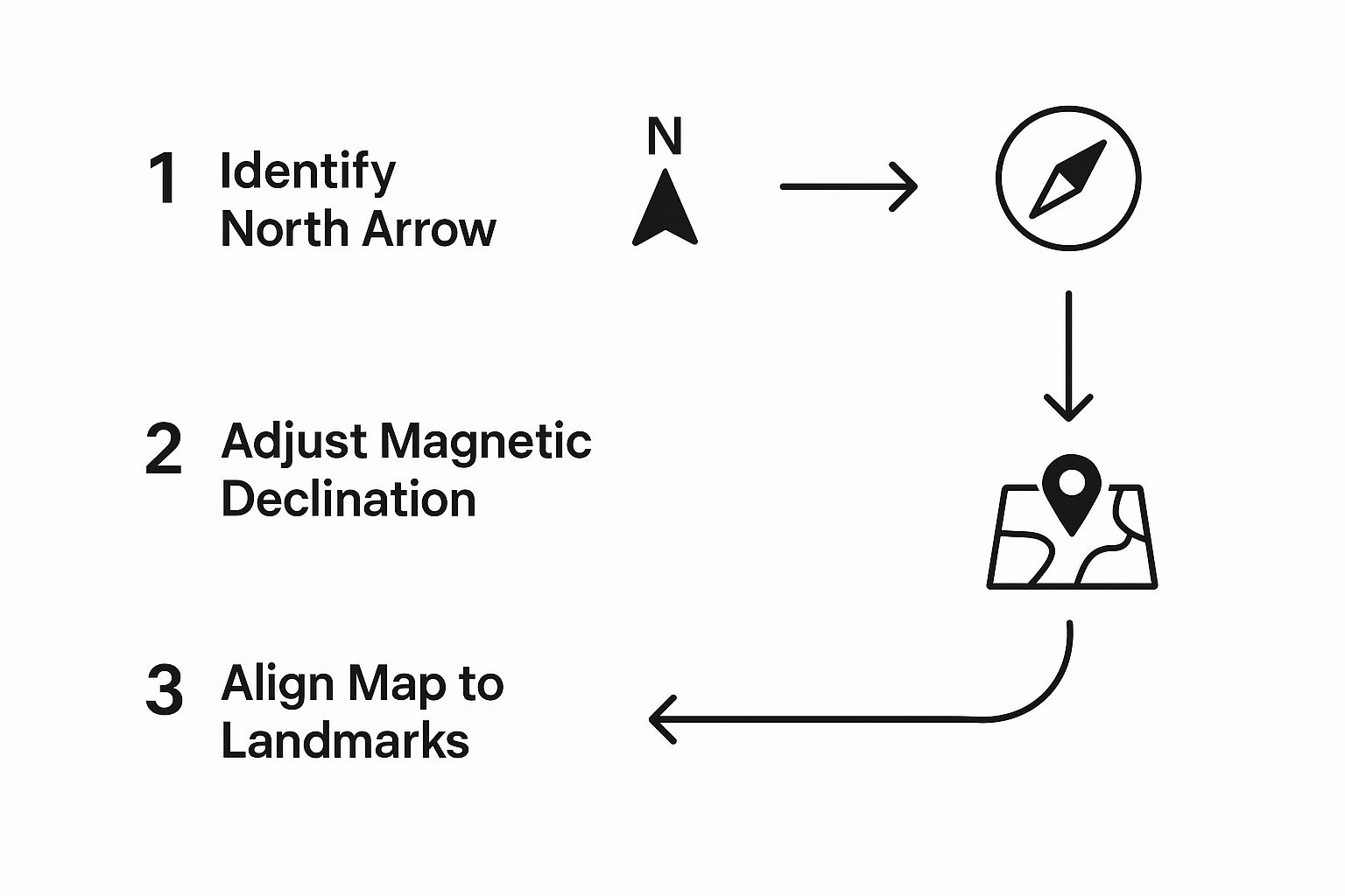
Getting this part right—finding north, accounting for declination, and lining up your map with the world around you—is the foundation for everything else.
Now, let's talk time. Using the edge of your compass and the map's bar scale, you measure your route. Maybe it comes out to five miles. But a map-mile isn't a real-world mile. You have to factor in the elevation. By counting the contour lines, you figure out there's 2,000 feet of climbing. A five-mile hike with that much gain is a completely different beast than a flat five-miler.
A well-planned route is a story told by the map. It has a beginning (your trailhead), a middle (following handrails and hitting checkpoints), and an end (your destination), with a clear understanding of the challenges (steep climbs) along the way.
Finally, you layer in the details that keep you safe and comfortable. You use the symbols to pinpoint reliable water sources (solid blue lines for perennial streams) and identify potential escape routes, like an intersecting trail (a dashed black line). While I'm a firm believer in carrying a physical map, I also use digital tools. If you're looking for a good backup, check out this guide to the https://trekology.com/blogs/hiking-and-trekking/best-hiking-apps on the market.
Once you get comfortable with this process, you can confidently plan incredible trips, like tackling the top hiking trails in Gatlinburg. You're no longer just looking at a piece of paper; you're creating a strategic plan for an awesome and safe adventure.
Even after you think you've nailed how to read a topographic map, questions always seem to pop up once you're actually out in the woods. Reading a map at your kitchen table is one thing; navigating in the real world, with its unexpected twists and turns, is another beast entirely.
This is where we get into the nitty-gritty. I want to tackle some of the most common hang-ups I see with both new and intermediate map users—the practical stuff that often makes the difference between a smooth trip and a frustrating detour.
Hands down, the single most critical error is ignoring magnetic declination. It’s such a common mistake: someone diligently orients their map with a compass but completely forgets to adjust for the angle difference between where the needle points (magnetic north) and the top of their map (true north).
It might feel like a tiny detail, but over a few miles, that seemingly small discrepancy can have a massive impact. A few degrees of error can easily throw you hundreds of yards off course. That's more than enough to miss a critical trail junction or find yourself dropping into the wrong drainage entirely.
Always check the declination diagram on your map and set it on your compass before you even take your first step. Make it a non-negotiable part of your pre-hike ritual. This one habit is probably the most important one you can develop for accurate navigation.
Just look at how close the contour lines are to each other. This is the quickest, most intuitive way to get a feel for the terrain without doing any math.
If you want to get a bit more specific, find the map's contour interval (it's usually in the margin, something like 40 feet) and use the bar scale. This lets you see exactly how much elevation you'll gain over a certain distance on the ground. It’s the difference between knowing "that's steep" and knowing "that's a 400-foot climb in the next quarter-mile."
That really depends on what you're using it for. The good news is that Mother Nature's big features—mountains, major rivers, ridges—don't change much. For identifying those massive landforms, the contour lines on an older map are generally still your best friend.
The problem comes with anything man-made. Trails get rerouted or disappear completely. Old logging roads become overgrown and impassable. New buildings or roads can pop up where your map shows nothing but trees.
Always, always check the map's publication date. If you're heading deep into a wilderness area and navigating primarily by associating the terrain around you with the contour lines, an old map can often get the job done. But if you are relying on trails, roads, or other human features, you absolutely need the most recent version you can find to avoid some potentially dangerous surprises.
At TREKOLOGY, we believe that the right gear makes every adventure safer and more enjoyable. From our ultralight trekking poles that save your knees on steep terrain to our comfortable camp chairs for that well-deserved rest, our equipment is designed to support your journey. Explore our full collection of thoughtfully engineered outdoor gear at https://trekology.com.
Leave a comment